The KRAKEN DATA team took a quick look at the Harvey Norman website, we were inpressed how far it has come in the last few years, but still thought there were some areas worth looking at.
Once again we restricted ourselves to just 10 minutes to keep us focused and not too worried about detail.
Harvey Norman is a behemoth in the Australian retail scene – here is their website. Challenged by both the move to online and from overseas stores, it has continued with its store strategy. Now though it seems to be prepared to face the online world head on
The moment you arrive on the site you are presented with a huge variety of options and messages, I would certainly look at testing content removal initially. Is there any content there that is just plain noise? Below are 10 other simple tests or areas to look at.
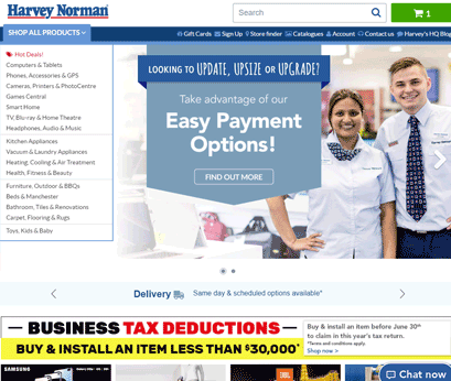
1. Carousels
Yep, here we go again – the good old carousel (x2).
We have talked at length about carousels and the impact they can have on visitor engagement, more often than not negative. Harvey Norman actually display two carousels on the home page, both visible above the fold. This leads to a busy and confusing UI that competes for attention. Better to test which messaging adds value to the visitor journey and give them prominence.
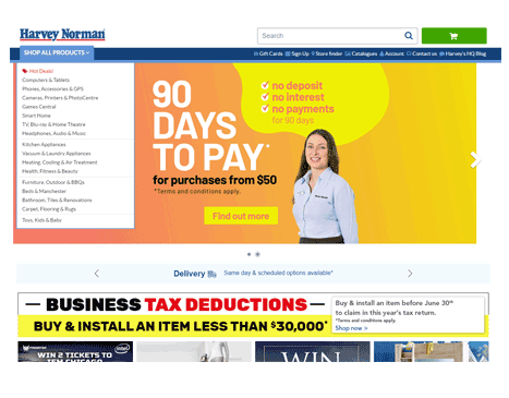
2. Help Popup
Can be both helpful and a boost for user engagement, but here it seems too early in the visitor journey.
After a few seconds I was shown a help popup – I was actually just trying to get my head around the carousels and take in the messaging there! Testing where and when the help is shown would ensure it is used only for the benefit of the visitor and ultimately for the greatest revenue impact.
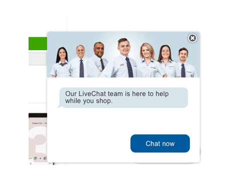
3. Confused Content?
The current tax deductions messaging is a powerful way to encourage business purchasing.
But on the current homepage the messaging seems confusing. The banner is grouped with 4 other banners that seem connected, but the other 4 are nothing to do with the tax deductions. It would be great to test reinforcing this tax-time message with associated products that match the banner.
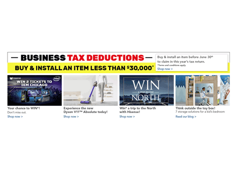
4. The Megamenu
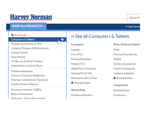
Currently if you use the dropdown megamenu, the only way to navigate to a section is to choose an option from the area to the right. If you click on a top level item it doesn’t take you anywhere.
Even clicking the small chevron doesn’t allow for any navigation. Is this clear enough for visitors? What would be the effect of making these navigation links?
5. Shopping Cart
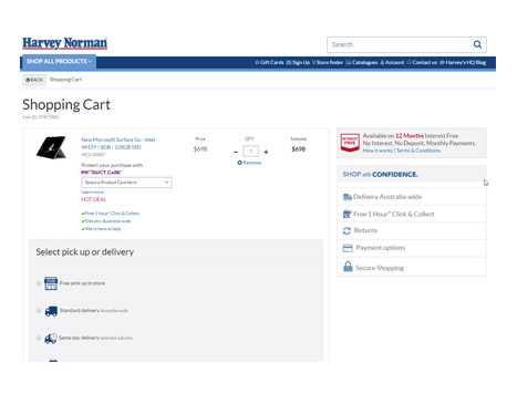
We would test lifting the position of the main CTAs (Delivery, Continue to Checkout) by placing them to the right where the USPs currently sit.
The USP position would also be tested, separating them in a separate bar at the top of the page for example. This serves to group all the purchasing decisions together and make them all visible upon entry to the cart page.
6. Login
An opportunity exists to engage with existing customers early in the return visit. It may allow for repeat orders to be placed easily or to highlight the faster checkout experience.
Currently the login is only displayed as “Account" in the top section, in the checkout process or in the footer, testing the impact of a more distinct login could yield great results. This could especially target returning visitors.
7. Hot Deals
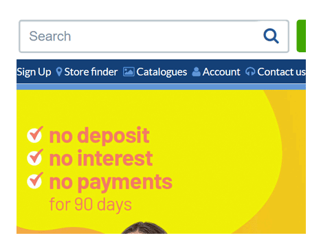
A lot of real estate is given to the Hot Deals banner, does it actually help with visitor engagement/conversion?
Is it better to show more of the actual “hot deals" in place of this static content?

8. Limited Time Only
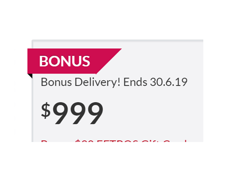
The limited time feature is a great chance to test the way it is displayed.
Is it better to show the visitor the end date of the promotion or is it better to explicitly state how many days are left before the promotion ends? FOMO and urgency messaging was discussed in an earlier blog post.
9. Use of Colour
It is a common theme when we look through websites, is the use of colour appropriate for the content?
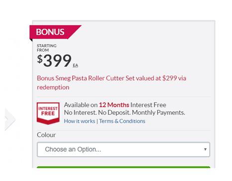
On the product pages we see red used to highlight bonus offers and similar content. Is this the best colour, I know that every time I use ANZ business banking to make a payment that the success message is in red and it always makes my heart skip a beat (have I made a mistake?!?).
10. Recently Viewed Items
We have tested the implementation of a recently viewed items module. This shows the last 4-5 items the visitor has looked at and allows for easy navigation back and forth.
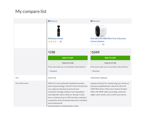
Whilst the site does have a compare function, we have found that visitors tend to use a recently viewed section in the same way. A test here could should show whether it is beneficial to the buying experience.
If you would like to talk about your own website/online business and how KRAKEN DATA can help you lift conversions please contact us, we love chatting about analytics and optimisation!